Tuesday, October 10, 2006

Bill paints gorgeous flowers and this was one week's lesson. He put more color in his background but I didn't dare mess with mine!
Mine is pretty flat looking but I'm working on those curves and shadows!
Again, water soluble oils. I really like these -- so easy to clean up and very little odor.
This is an other oil, also done following a scene in a desk calendar and done in the same time period.
This is another oil I did soon after the first -- with Bill's excellent instruction. It is standing on a picture holder -- thus the silver hooks in front. Again, I didn't get the mountains to "shape" the way I wanted them to but really like the sky so kept it. I just can't seem to "see" 3-D or even 2-D -- so my paintings tend to be flat. Again, practice is very lacking. I'll have to take another photo of this one framed -- looks a bit better than with the easel pieces showing in front!
The next week I wanted to try the same painting (done in water soluble oils) in water colors. Compare to the one below. I think I like the oil better because it resembles the photo more closely -- deeper hues -- more intense. I somehow just don't "get" the way to layer watercolors to get the vibrant colors I'd like -- and I have to admit, I just don't practice like I should. I have so many other arts and crafts interests and I'm impatient! Bad combination.
After taking water color lessons from Bill Tippie for about a year and a half I seemed to be losing what little talent I had developed (not Bill's fault!!). So I asked if he would teach me to oil paint. I had seen a photo of this scene in a daily desk calendar. This was my first attempt -- smooth paint -- no deep paint layering. I really enjoyed the process and liked the effect and it came out pretty close to the photo in the calendar.
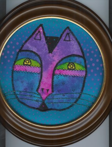
Our quilt art group challenge earlier this year was to do a fabric self-portrait, based on those in Quilting Arts magazine. I couldn't come up with anything so wimped out and did a cat face, ala Laura Burch style.
This is my first wool felt project -- a pin cushion, made in a class earlier this year. Pretty simple and easy -- my kind of project!
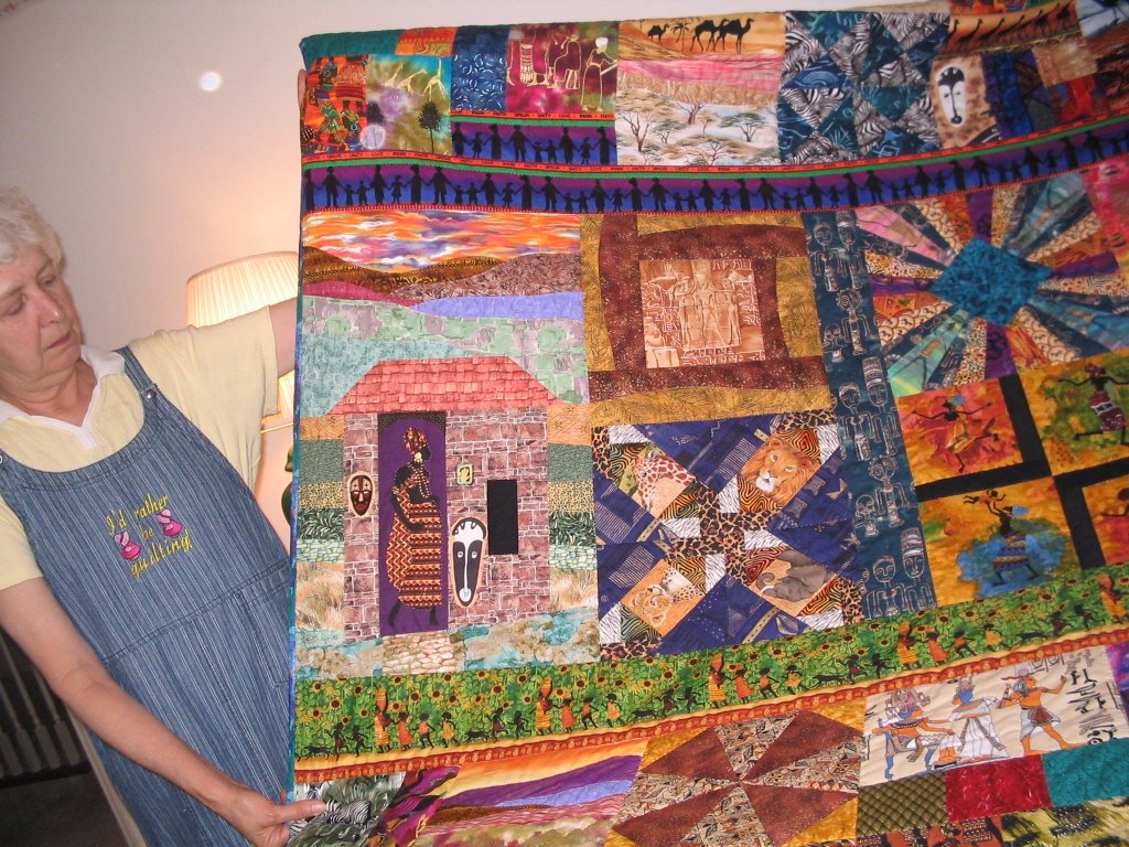
This is more detailed close-up of one of the panels on Janet's African-themed quilts. I took some photos for her upcoming show at the main library gallery to be held in 2007. She taught me this pagoda square too. I think it's really unique. Janet doesn't have a web site but stay tuned for
more photos. She's been making the most wonderful, brightly colored quilts from fabrics lines like Laura Burch and Sherrill Kahn and has inspired me to do one for my bedroom this winter. She's been using the patterns Yellow Brick Road and Turning Twenty Again, which I will also use.
Blogger would not let me post this message with the two photos below. The first one shows Janet Serrenho with one of her African themed quilts -- foundation pieced blocks -- showing some of the details of the blocks -- including a scenic one she designed herself. The photo under that shows one of her complete African themed quilts.
I met a quilter several months ago who had a marvelous display of African themed quilts on display at the local library rotunda. She kindly offered to teach me the method she used -- paper /foundation piecing. This is my first feeble attempt at a block. Her name is Janet Serrenho and I will post a couple of her quilts next.
This is my first crazy quilt postcard -- a bit larger than 4" x 6" and a bit boring with too many of the same colors but it WAS a first try!

When I first started to do crazy quilting my first block did not come out as I'd hoped. Loving to recycle I decided to crazy quilt my old sewing ham. I glued the fabrics (velvets and silks) and trims with fabri-tac glue and it worked!
It's still not useful but it's a lot more interesting to look at!

Sunday, October 08, 2006

I will be gradually posting more of my older art pieces, handmade books, etc. as I find time to
either scan them or take pictures and download. Prepare to be further bored!

Happy Creating to all,
Lorraine

Oh, and there will be pictures of my fur kinds to follow too!
I always loved the white and silver birches in Vermont. Bill taught me how to paint them and in his painting the trees have the roundness of trees, unlike my flatter version! But I liked it enough to frame it and put it in the living room, along with several of his very professional ones. I still can't "see" how to get the roundness worked out but maybe in time! I do love how he taught me to
do the background on this one.
This used to be my favorite spot on some land we owned in Berea -- at the foothills of the Appalachian mountains. The land there reminds me a lot of Vermont. This area was reached by a gradually sloping hike through the sparse trees and wild flowers and opened into this loose circle of trees.
We used to hang our hammocks from the trees and read, talk, and stare up through the trees to the gorgeous sky and sun above. We even camped out here one night accompanied by a neighbor's dog who didn't much like the tent or the fact that we disappeared inside it. We said our personally written wedding vows here, after saying the traditional ones at the judge's office. The trees had fallen in such a way as to make a number of places to sit and recline and rest after a good hike. Unfortunately now trespassers with off road vehicles have destroyed this area; their owners taking chainsaws to the partially fallen trees and logs and moving them out of their path. I am glad that I have the photo I painted this from and this as yet unframed watercolor to remind me of happier days on that land. I framed this is a gold frame and it really "helps" the painting!
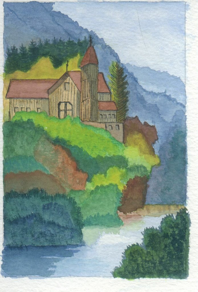
Bill had another student who wanted to paint a castle and he asked if I'd like to do one also. Castles don't excite me as something to paint so I said I'd like to do something similar -- a Vermont farm house and attached barn, high up on a mountain as so many were and are, with a magnificent view over the valley. I still have a lot of practice to capture the beauty of this but it was another fun experience. This one also looks a lot better now that it's framed
One day, knowing how badly I wanted to paint cats, and knowing how frustrated I was because I could not get the results I wanted, Bill suggested we do some whimsical cats. This was so much fun. We did several but I have this one framed and hanging in my cat decorated bathroom.
One of my very early water colors. I started learning wc from Bill and did that for a year and a half and suddenly decided to switch to oils -- painting flat like acrylics. Here I was trying to capture the Green Mounts of Vermont. Remember, it was one of my first! And is not framed and hanging on my wall! Perhaps I'll get it out one day and work on it again.

Saturday, October 07, 2006

This is one of my early attempts at oil painting -- I love trees and I love snow. I've been taking lessons off and on from a Lexington painter named Bill Tippie (www.tippieart.com). Please don't judge my feeble efforts by his magnificent paintings! This was a gift for my sister in law who saw it and oohed and aahed. How could I resit that!

Sunday, October 01, 2006

This is the revised 3rd impessionist painting.
Still not sure I like it but I'm done playing with it; time to move on. This is fairly 3-d with the paint though so I think I'm finally "getting" it after 4 lessons. It's difficult not to paint "smooth!" Working on a Wolf Kahn larger painting now -- it will be awhile before that's posted!!!
My 3rd impressionist painting. I liked the sky but not the bottom so I added the tree and a pile of leaves; still thought the cat overwhelmed the tree. Kept turning it upside down, looking at it in the mirror. DH said he liked it the way it was.
I still didn't. So revised it this weekend. See new one above.

Saturday, September 30, 2006

My 2nd impressionist oil. What does it need?
It is a take-off on a very foggy London skyline.
Can't remember if it was Money or not. I didn't like the buildings so tried to do mountains. It's darker
than the one I was using as a guide.
This is my first impressionistic oil painting. It's supposed to be a take-off on one of Money's lily ponds. It's pretty flat. I'm seeking advice. Is it
done? Is it ready to be framed? I like the colors but not sure if I should do more to it.
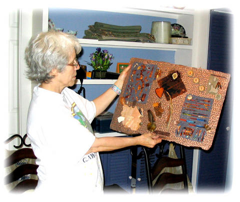
This is the 9 x 12 collage I did at the Galorious Stampers retreat. I knew I'd bought a frame at a yard sale or Goodwill that had copper on it and today I found it. Had to trim the collage to 8 x 10 but it was worth it -- the copper and teal! Wow and I paid all of 50 cents for it. It makes up for the fact that I paid $8.00 for the handmade coffee card on top!! It matched my handmade paper and the colored piece of Tyvek I had so I "had" to buy it. It is made by
M.J. Berry and I bought it at a local arts and crafts fair.
I went out to mail some things this morning and lying next to the mailbox was this incredible leaf. I ran it through the Xyron to preserve it but it wrinkled and I put it through the wrong way so I just put it on a piece of cardstock. Is there any way I can preserve this so the colors will stay. Isn't it the most incredibly colored leaf???
I call this one The Broccoli Forest! Again, I added some pieces
to the original with the smaller pieces of broccoli and then used
a very small piece for the grass. Luckily the small piece had a
thin vein which really stood out and made the grass-like image.
Also used both brown and green stamp pads.

This was so much fun I think I'll try other foods when I have
the opportunity.
Playing with my food! This weekend is one of "finishing up some UFOs" (unfinished objects) and the first thing this morning was to work on an oil painting -- can't show that until it's dry and I can work on it some more. Next was to add to the single images I
stamped with a large stalk of broccoli at the stamp retreat.

Today I used a smaller piece and different stamp pads to give
a difference in color. I also cut the broccoli apart to apply the
tops a little better.

Wednesday, September 27, 2006


Sorry that I'm still getting some of the writing over the artwork. I've tried putting in the
artwork first and everything looks good until it's published. Will keep trying to get it right!

I did manage to get one more modern art cat done between the Stamping Getaway and the
Art Bash North this past weekend (I'll post from that wonderful getaway in a day or so).

I found a book on Paul Klee and incorporated several techniques from various of his paintings
into my 3rd Abstract cat. His name is, of course,
Klee Kat.
I demoed my new Stamp Press -- with foil strips only. Gina tried alcohol inks on a piece and got some neat results. I tried DTP and it was so so. I didn't have a great deal of luck using the rolling ink pad but have since purchased the video and learned everything I did wrong and we'll play with this again with all kinds of media (cardstock, clay, metallic paper and different colors of ink cartridges. These are, of course, Paula Best, rollers.
Pat brought her Twinkling H20s and we played with them on both dark glossy and white matte cardstock. You apply the paints to the rubber stamp with a small paint brush and then spritz lightly with water. The card on the left shows 3 stampings from one paint application -- with water spritzed once more after the initial one.
Again, the dark one does not show the beauty of the final product.
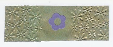
Marti brought her marvelous QuickKutz machine and we not only cut out images (flower in middle) but also placed decorative paper between the fold-over dies and could either emboss or deboss the image. We could have also embossed the die cuts but ran out of time to play!
The dolls posing with their own little dolls.
Netta taught us to make paper dolls (or flat people) and I of course had to use the Paula Best cat stamp. We pinned all our
dolls (see next picture) to a cork board and when we woke up the next morning we found that the dolls had all acquired a miniature worry doll of their own. Who knows what other mischief they got into during the night while we slept soundly after a hards day's play!
Brenna taught us this great technique using brass stencils, plain ol' spackling compound, and an old credit card. This makes a slightly raised surface that dries to an opaque white but can be colored by
chalks, paints, etc. This was my favorite (after several sloppy tries!).
Same cat on the reverse side. The fun thing about
these is that you can use either the embossed or the debossed side.
This is (what else) a cat brass stencil run through
Nita's new Big Shot. What a cool machine. And
Nita made some great cards with her images. I
will do some embellishing to the cat before I call it done! These cards look great with chalks, sanded, or
even painted with brushes or markers.
This one was so much fun. I just took the felt
blotter that I used on the previous card and set it down in rows all across the card. There was enough ink left in the sponge to do the whole card. Again, the colors are very vibrant gold, silver and copper with the black glossy stock showing through. I feel another framing job
coming up!
This was my favorite metallic inks on dark glossy stock. So many possibilities for a background like this but I hate to cover it up!
Dark glossy cardstock first sprayed with alcohol. Then we
dropped metallic alochol inks on surface and then dragged a credit card across. Looks like an outer space vision!
Again, the colors in real life are stupendous.
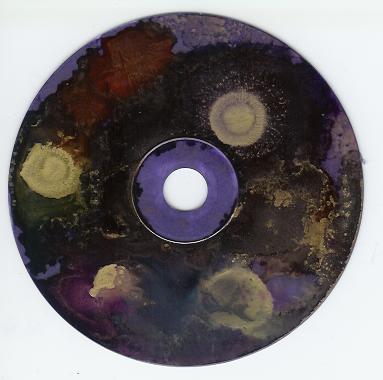
At our retreat, Gina taught us lots of surfaces on which to paint alcohol inks. This is my first CD.
It is amazing to watch the interaction of the inks with the alcohols. This does not begin to show the beauty of the finished product.

We also did large and small tiles, dark and light glossy cardstock an loved them all. Below are samples of some of the paper versions. Gina will be putting a final finish on our tiles for us so will post those later.
This is another collage I made at our stamping retreat.
The first sheet is a painted Tyvek envelope my friend Lin
sent me, the second sheet, wrapped with fibers, is one of
my recent pieces of handmade paper with various fiber
and paper inclusions. The card is one I purchased -- because it was about coffee and because it had the perfect colors to go with my two pieces of paper. The card has a piece of teal fabric, then a painted piece of brown paper, topped by a piece of decorative paper and then another, stamped with a coffee cup. Then a small strip is zigzagged on a sewing machine. I have since framed this is a gold frame. Where to hang it on my already full walls!

Monday, September 18, 2006


On the Artists of the Roundtable group we are making the books in "Book Arts" by Mary Kaye Seckler. This weekend I got caught up and made the first two books: Memories of Paris and the second was supposed to Atlas' Secret but I changed it to an Asian theme. This has been so much
fun and especially since the ART team placed my Paris book on their web page! Yahoo -- my 15
minutes of fame!!!

Sunday, September 17, 2006

My second Katkinsky created this week. I don't like him
as much as the first one but this was one done in two
hours or less and took on a life of his own!

Friday, September 15, 2006

The collage I worked on while at the retreat. I'll
post the finished product when I finish it!!
The two grayish pieces are handmade pieces of
paper I made this spring with fabric inclusions
and the middle piece is a black piece of fabric
I "artfully" bleached in a fabric art class.
Lorraine


I had just read about stamping with food before we went on the stamping retreat so "stole" a half stalk of broccoli from the kitchen to try this out -- it was a great success and I'm going to add more food stampings to this sheet.
Several members of our Galorious Stampers
group at the Harmony House near Oxford,
Ohio, just across the line into Indiana, 9/9/06.

Wonderful friends, great fun with arty things,
superb accommodations, 4 days of sunshine
and moderate temps, too much good food,
too little sleep, and we can't wait to do it again!

Left to Right, back row:
Lorraine, Marti, Anita, Pat, GG and Debra;
In front: Brenna and Netta

Lorraine


Another Fabric Postcard
This is my Sept. swap card. I think it's a bit out of season for
kite flying but I had such fun doing the last one, I thought I'd
do another.
Lorraine